 Munin is a great tool, and it seems quite easy to monitor how your NTP service is going overall. E.g.: it's easy to put a web page together with all the offset graphs for your servers.
Unfortunately, this is far from optimal. In fact, the graphs will have different scales on the y axis, so a glance is not enough to check how they are doing overall. You'll actually need to check which values are displayed at the left side of the graph. This is annoying, because if you don't pain enough attention, you could miss bad things happening.
That's why I threw a reluctant eye to rrdtool's graph stuff. I've always been scared by the apparent complexity of the syntax, but I found out that what I needed was easy indeed. …Like this:
#!/bin/bash

RRDPATH=/where/rrd/files/are
IMGPATH=/where/images/will/go
IMGNAME=ntpint.png
IMGFMT=PNG
WIDTH=500
HEIGHT=300
LIMIT=0.005
TITLE="Offset"
VLABEL="milliseconds"

COLORS=("0000ff" "00ff00" "ff0000" "990000")
CIDX=0

GRAPHDEF='HRULE:0#000000'

for FILE in $RRDPATH/*-ntp_kernel_pll_off-ntp_pll_off-g.rrd
do
  BASE=$(basename $FILE)
  SERVER=${BASE%%-ntp_kernel_pll_off-ntp_pll_off-g.rrd}
  LABEL=${SERVER%%.*}
  COLOR=${COLORS[$CIDX]}

  GRAPHDEF="$GRAPHDEF DEF:$LABEL=$FILE:42:AVERAGE LINE2:$LABEL#$COLOR:$LABEL "

  CIDX=$(($CIDX+1))
done

rrdtool graph $IMGPATH/$IMGNAME
  --start -1d
  --title $TITLE
  --vertical-label $VLABEL
  --width $WIDTH
  --height $HEIGHT
  --full-size-mode
  --upper-limit $LIMIT
  --lower-limit "-$LIMIT"
  --rigid
  --imgformat $IMGFMT
  $GRAPHDEF
So basically, the script iterates over RRD files found in $RRDPATH, and adding to the graph definition in $GRAPHDEF. Finally, a single command will merge the offset information together in a single, fixed-range graph. With some changes, you can get rid of all those variables and use command-line options instead, which would make it much more flexible.
The final results looks like this:
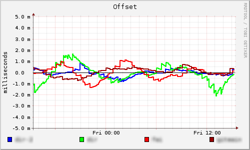
And, of course, if you couple this script with a web server and cron, you can have the image update regularly and you can keep an eye on it from your web browser.
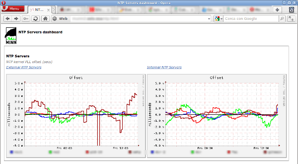
And if you have many sets of NTP servers, you can use the same script to create an image for each set and put them on a single page, creating a nice dashboard. And since all the graphs will be the same scale on the y axis, this time it will take just a glance to tell if something is wrong or not.

Does this pull from ntpd? Can you please tell the the command used to create the RRD database for this and the bash script that updates the database?
The script simply builds on Munin’s RRD files: I don’t create the files by myself, nor I query ntpd directly. Munin does it all for me.